
Blogs /
Our Top Picks for 2025
As 2025 draws to a close, Yellow Peach Designer Matt Campbell takes a moment to highlight some of the websites that stood out this year. From bold, experimental interfaces to beautifully crafted storytelling, these sites have caught our eye for their creativity, usability, and attention to detail.
Selected from a wide range of industries, each example showcases something unique, whether it’s clever interaction design, stunning visuals, or an innovative approach to user experience. They’ve not only inspired us on our own projects but have also helped shape our thinking about what’s possible in web design as we head into the new year.
This collection is a celebration of ideas that push boundaries, spark curiosity, and remind us why we love building digital experiences.
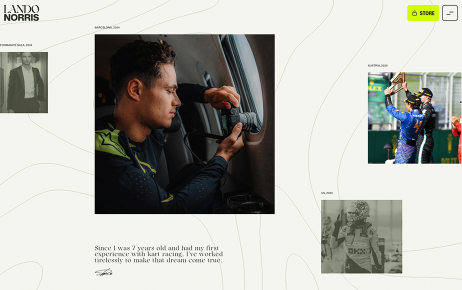
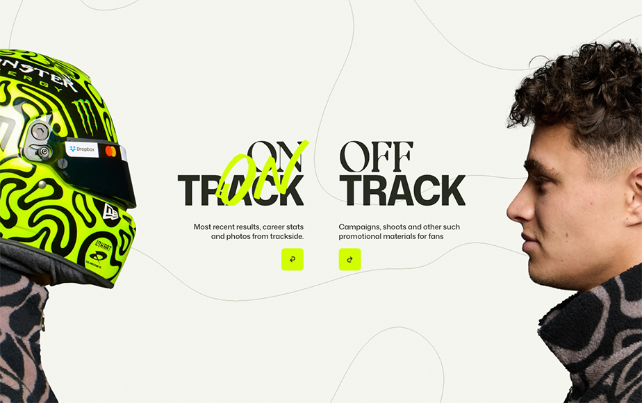
Lando Norris – Our Favourite User Experience
The website of 2025 Drivers’ Champion Lando Norris, designed by OFF+BRAND and developed on Webflow, beautifully utilises storytelling through motion to reflect the personality and pace of the driver himself.
A fluid, animated background runs throughout the site, drawing directly from the visual language of Lando’s helmet designs and product range. This creates a strong sense of brand continuity, while giving the site a distinctive, energetic feel from the first interaction.
The site places a clear emphasis on personal storytelling. Photography from different stages of Lando’s career is used to show his progression over time, helping fans connect with both his achievements and his journey. This is complemented by a grid gallery showcasing every helmet design, which works as both a visual archive and a celebration of his evolving identity as a driver.
Upcoming races are presented in a highly visual and engaging way. The next event in the calendar is highlighted through an interactive 3D track map, paired with key circuit statistics and clear information on race start times in the user’s local timezone. This makes complex race details easy to understand at a glance, while building anticipation for what’s coming next.
On-track performance is broken down into clearly defined sections, covering recent results, the next race, and career totals to date. This structured approach allows fans to explore detailed statistics without feeling overwhelmed, balancing depth with clarity.
Throughout the experience, GSAP-driven animations are used to add polish and momentum, making transitions feel smooth and responsive across devices. The result is a website that feels fast, modern and confident, closely mirroring Lando Norris’ character and presence on track.
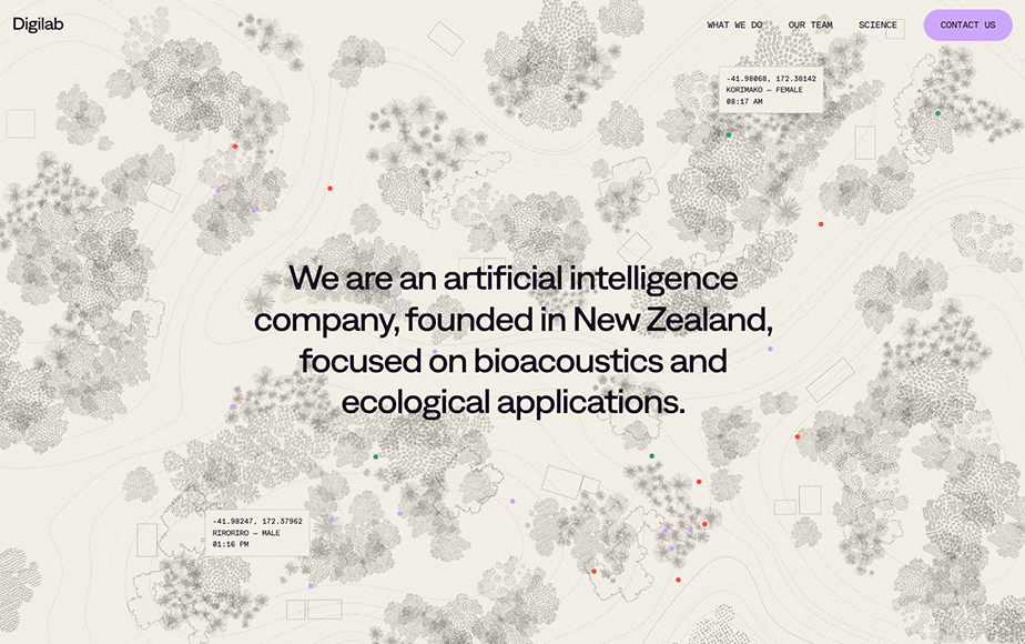
Digilab – Our Favourite Single Page Website
Digilab is a New Zealand–based technology company that combines artificial intelligence with autonomous recording devices to detect, identify, and track species within defined environments.
The award-winning website, developed by Numbered, utilises scroll-driven GSAP animations to guide users through the full lifecycle of the product, from on-site installation to data capture and analysis. These animations establish a clear sense of progression between each stage, translating a highly complex and technical process into an intuitive, visually engaging narrative.
As the platform is built around audio analysis, the website uses sound to support its storytelling. Certain sections provide users with the ability to listen to example recordings captured by the system, helping them understand exactly what the software is analysing and providing clear context that helps users grasp why this capability is so impressive.
The website also links to a simple interactive demo that shows the technology in action. Users can listen to recordings from individual birds and see where they move over time on a digital map, shown in both 2D and 3D views. This anchors the web experience in reality, and helps people understand how the platform translates sound recordings into clear, actionable insights.
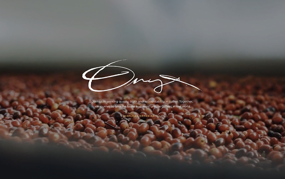
Onyx Coffee – Our Favourite eCommerce Website
Onyx Coffee’s website, winner of Best ECommerce Website at the 2025 Webby Awards, draws from the gothic style of the packaging itself, combining rich colours, striking typography, and tiny imperfections that make the site feel tactile and handcrafted.
The generous use of video brings the coffee and its journey to life, from the first pour to the café experience. Each product page is uniquely styled to match the packaging and comes packed with recipes, video guides, and timers to help you brew the perfect cup at home. These thoughtful touches turn casual visitors into fans, giving them reasons to come back and explore new flavours again and again.
Scroll-based animations guide users naturally through the story of the product without ever feeling overdone. Combined with spectacular photography, they draw users closer to the experience, making the coffee feel tangible even through a screen.
Beyond just showing the product, the site communicates a lifestyle. It reflects the care, craft, and personality behind every cup, making the brand feel approachable yet premium. The combination of immersive visuals, playful interactions, and practical guidance for brewing makes the website not just a shop, but a full sensory experience, one that perfectly mirrors the energy, style, and attitude of Onyx Coffee itself.
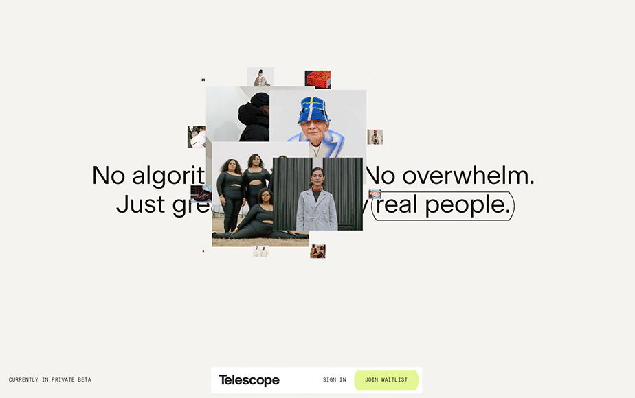
Telescope – Our Favourite Animated Website
Telescope is an animation-led landing page designed to introduce and build anticipation for a new social platform launching next year. The site pairs a restrained, minimal visual language with bold, scroll-driven transitions, creating an experience that feels engaging without becoming overwhelming.
Rather than relying on dense interface elements, the design allows motion to do most of the work. Carefully choreographed section transitions guide users through the page, ensuring the experience remains clear and focused even as the animations become more dramatic.
Each section acts as a showcase for considered GSAP animation, often carrying a single visual element forward from the previous section to create a smooth, continuous flow. Layouts shift significantly between sections, keeping the experience feeling fresh while ensuring that each moment directly supports the message being presented.
This interactive approach encourages users to keep scrolling, rewarding curiosity with new visual ideas and transitions. In doing so, the site successfully builds excitement and intrigue, an essential outcome when introducing a product that has yet to launch.
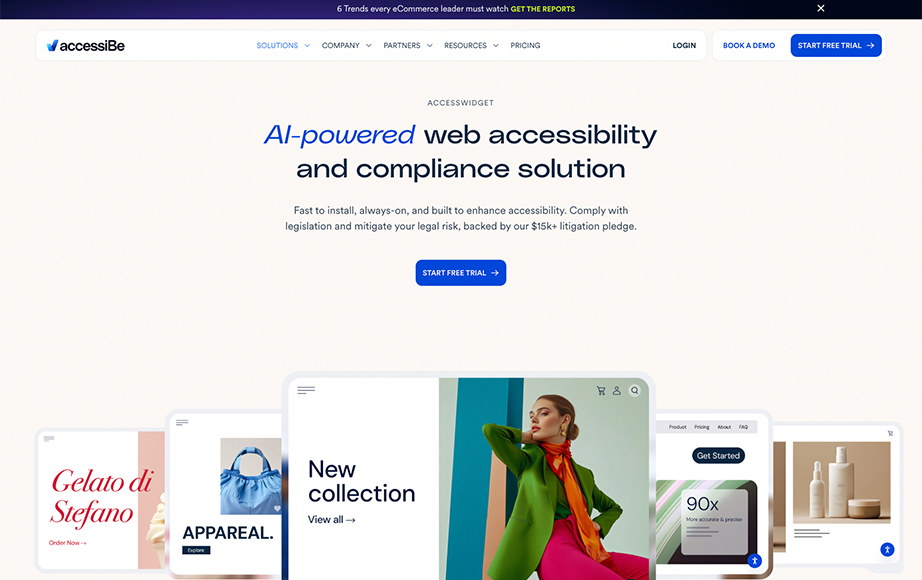
AccessiBe – Our Favourite Accessible Website
AccessiBe’s website demonstrates that accessibility and strong visual design are not mutually exclusive. As an online accessibility analytics tool, the platform quite literally practises what it preaches, using its own site to show how an inclusive experience can still feel modern, polished, and visually engaging.
The site offers a wide range of accessibility tools designed to support users with differing needs, including those with cognitive disabilities, epilepsy, ADHD, and users who rely entirely on screen readers. These features are integrated seamlessly into the experience, ensuring they enhance usability without disrupting the overall design.
Typography is handled with particular care. A minimum base font size of 16px is used by default, creating a readable foundation from the outset. From there, users are given full control over how text is displayed, with options to adjust font size, line height, letter spacing, alignment, and even font family. This flexibility allows individuals to tailor the reading experience to suit their own comfort and needs.
The site’s heading structure is clearly defined and consistently applied, supporting both accessibility best practices and search engine optimisation. This ensures content is easy to navigate for assistive technologies while remaining logically structured for all users.
Keyboard navigation is also well considered. Refined “skip to” links allow users to jump directly to key areas such as the main navigation, core content, or footer, avoiding the need to tab through long sequences of interactive elements. Focus states for buttons, form fields, and other controls are clearly visible, providing confidence and clarity for keyboard-only users.
Throughout the site, imagery is supported by descriptive alt text, and interactive elements are enhanced with appropriate ARIA labels and states. Together, these details ensure the website remains understandable and usable for users who cannot rely on visual cues alone, reinforcing AccessiBe’s commitment to inclusive design through real-world execution.